

Ætheling
-
Posts
4,087 -
Joined
-
Last visited
Content Type
Profiles
Forums
Gallery
Events
Articles
Posts posted by Ætheling
-
-
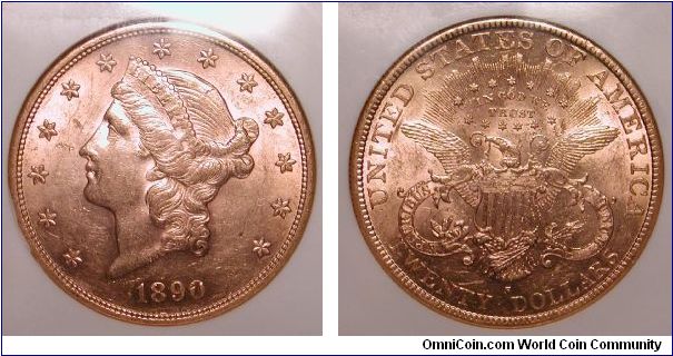
Liberty.
I only own it for a few more months, then again after Mom passes.
Once more Tiff....

(My favourite US coin of all time).
-
The $20 as designed by James Longacre issued upto 1907 are either Coronet Liberties, or Liberties. Usually just referred to as the $20 Liberty.
The front facing liberty issues from 1907 to 1933 were designed by Augustus Saint Gauden, and are thus referred to as either Saints or Saint Gaudens $20.
Or at least that's what i've always used.
-
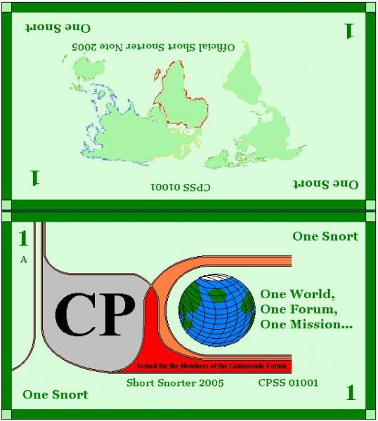
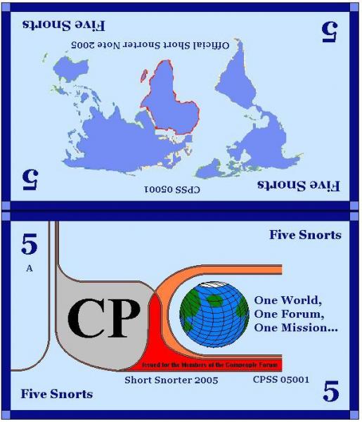
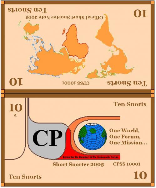
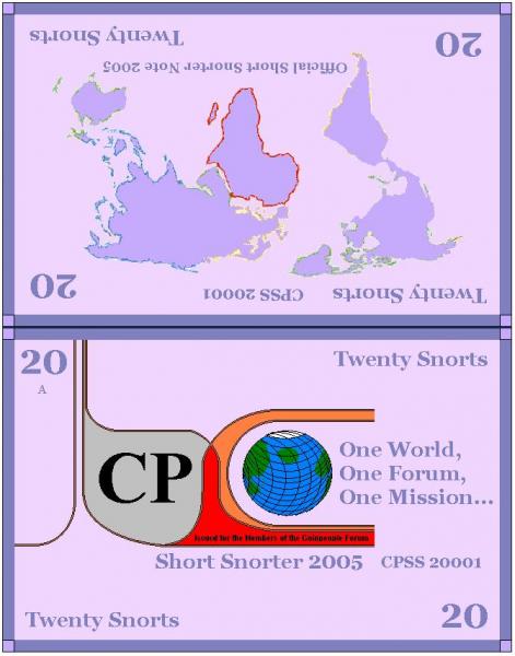
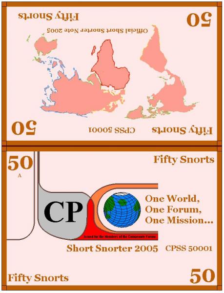
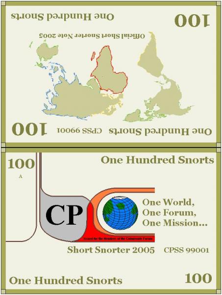
The Official Short Snorters for the 2005 Season were the first such specialised notes issued for the event. The Original Short Snorter run happened in 2004 and as that event drew to a close in June 2005 ideas were flying around for the new 2005 event. Art thought it would be a good idea to issue some special notes to celebrate the occasion.
The Imperial Bank of Coinpeople had just been setup earlier in that month and was commissioned to print and issue such notes. The first of the special run were issued in England at the S mint towards the end of June 2005. In total six complete sets were issued with a seventh incomplete set.
Of these; five complete sets and the one incomplete set were snapped up by members within the first few hours of being offered on Coinpeople. The remaining complete S mint set was shipped over to the A mint in the US to be held there until further notice.
The A mint is due to issue its unique set in the next few months, and this set will be the one that accompanies the Short Snorters as they make their rounds across the globe.
The notes were issued in six denominations;
-
I voted against George IV?
I voted against George IV...

I voted against George IV!
... Don't talk to me

-
Ah the Mercury Dime!
I usually leave that one out for a very good reason. When i first saw that design i just took to it, like a duck takes to water. They have a real charm about them and i certainly do not know what it is.
It's not like the obverse is all that pretty, i mean look at the stuck out chin! But regardless of the fact that i don't think they are beautiful, i still love 'em and i'd still happily collect them.
I've got about a few dozen of them somewhere and i won't part with them.
-
I don't mind Fugio's, but i'm quite tolerant to early copper coins, believe it or not.
Walkers i wasn't too bothered about until i actually got one, they look far better in person than they do in pictures.
Peace Dollars... surprisingly my attitude to those has softened a bit. Even if the poor dear on the obverse looks a bit gormless, she has a certain charm. Can't put my finger on it.
I still think Saints are way overrated though. Nice coins they sure are but 'the best' US coins ever? Nahhh, ain't no Liberty Nickel.
-
I'd say the Buff was imposing.
As coins go it most certainly stands out in my mind, which perhaps is more important that merely looking pretty? Say like a SLQ for instance.
-
Occasionally i even surprise myself, my mouse was hovering over the tick button for Gothic Florin, until the pictures loaded.
That Hungary one is sommat else! As much as i like the florin, the reverse design lets it down slightly being of less complex and intricate design than the obverse, i'm not saying Mr Dyce's reverse ain't nice but when put up against a coin with a shield and two angels it's hard going.
-
1683 no doubt about it. Nice tone, gorgeous design and i even like the lion. Age and beauty rolled into one.
I want one.
-
You know i wouldn't mind the Indian Head gold if it wasn't incuse! I've seen one in person and i've got to say i just don't like it. The design ain't the problem the fact it's not in relief is! I mean you know i like the $10 indian gold coins, the designs are not dissimilar (reverse wise anyhow) and i find that fine.
The Buffalo nickel, the major disagreement i have with that coin is the proportions, the reason i dislike it is the reason why i thought you would have disliked it. I remember you saying long ago Stu that the thing you liked most on coins was the contrast between the flat fields and the boldness of the design played off against one another, and this is why you didn't like hammered coins.
Well the buffalo nickel doesn't do the contrast between design and field either, why? Because the design is out of proportion to the size of the coin, so the fields are few and far between. If the coin was bigger but the design was the same size then perhaps i'd not give it as much rap. I agree whole heartedly with Charles Barber on the oversized design features.
-
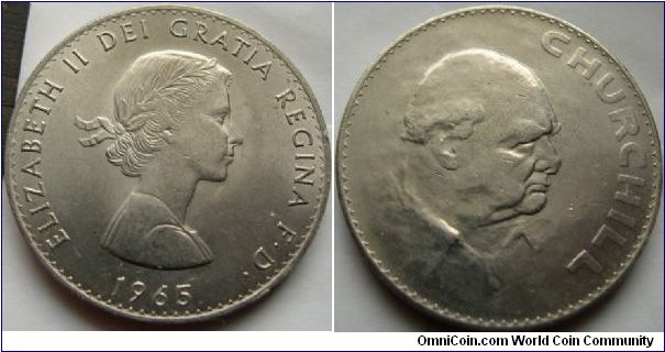
Nothing can match the Churchill Crown for hideousness.
I can think of a few US coins that i'd throw up against it as nearly as bad but very few US members agree with me. Since the two are perhaps the most popular 20th century US coin designs going. Hint one is gold and one is nickel. And no it's not Jefferson.
-
Anyway, how's this for a Beauty:
Now there is a monstrous coin. Some of the ugliest coins are Mint State.
-
I was referring more to the areas of colorful toning which I know you don't usually care much for, IIRC, and not the design. I can't tell AT or NT from the scan but you have it in hand so I will defer on that. If it was NT and not flat looking in person, it would be a shame to treat it as a junk pocket piece as it appears to have some interesting colors in between the darkness. If you are thinking of selling it for junk Morgan value, let me know...
I asked members on a few boards and the general consensus toward me was;
"That is so obviously AT, even a monkey could spot that one seven miles off, you stupid, stupid man" well they didn't say i was stupid but the way they put it when they replied (especially on RCC) kinda put the point across in terms that it could not be refuted.
So who am i to argue? (I can't tell the difference between AT and NT, that's why i avoid them).So there you go, i mean if you want it then you can have it Stujoe.
Minus the tone which looks yes flat and slapped on top, there looks to be alot of natural lustre shining away underneath, so whoever did this to this coin ruined a good one.
-
Hard to tell from what is probably a scan? but that one might be similar to me using an early hammered coin as a washer because I don't care for their typical look. Is the Morgan 'flat' in person? or is there life to the surfaces?
Oy what you on about Stu? I really like Morgan Dollars! The Morgan dollar must be one of my favourite US silver coins.
It's just this one has been artificially toned, and we're talking rather nastily too.
I've been wondering whether or not to dip it, but for what it's worth the dip would be juat as bad since it'd be just as damaging to the collectorbility as the fake tone is. Albeit the coin might already have been cleaned before it was ATed. The grade on the pice ain't bad though.
The reverse is quite nasty, a furry brown look it it. Not nice.
-
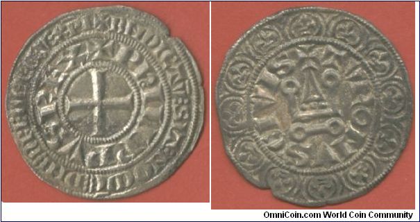
Here's an English penny from 1180;

and a French gross from 1290;
-
I voted for the Ruble. Don't like the Cromwell portrait at all.
Cromwell was definately not a pretty sight it has to be said, he apparently had quite a few warts to top those features off as well.
But put it this way since the Cromwell coin just breaks into a five figure sum dollar-wise it's not one to be turned down lightly!
I know i'll never have one.
-
I sometimes wonder if i should take the hobby back up but i never seem to ever do. I think if i did then i'd concentrate exclusively on either Victorian Line Engraved Issues. (I.e Penny Blacks, Penny Reds and Twopenny Blues) from 1840-1879.
Or it'd be the regular royal cypher/crown issues of George V (but there's far, far too many minor types and varities and colour variants and stuff). To say nothing of Victorian plate and watermark varities. As well as corner lettering types, two letters, four letters.
And whether to collect as VF used (i.e in EF condition with light overstamp) or as Mint unused is a question to ponder on.
There's just too much choice!
-
Oliver Cromwell!
Need i say more?
-
I got a Charles II 1670s gold half guinea Trantor that looks like that! A dealer even refused to buy it off of me for £20 (say $40) because he thought it was just unsellable. He said even £20 would be a push.
So it's been jingling around in my pocket for about a year since, it's probably not even gonna be worth that now.
-
I've got a British coin that looks much like that near blank Morgan.
These things made good pocket pieces.
-
Hammered coins are just spectacular. I love the old letters!
Amusingly the old letters are often the key point of designating which type/class a hammered coin can be ascribed to.
-
Alright so it ain't dated 1965 but i figure this one must be in the running.
I've been wondering whether to use it as a pocket piece or something. Makes a good paper weight though.
(Sorry about the size).

-
Well i could post some hammered coins that i think are nice eye appeal wise but i'd be in a minority, since the designs are most just legends and no portraits or pictures.
However perhaps the only coin i have that might be able to partake in this with any success is this.

Which is alright but it ain't no $20 Lib.
-
No rules for me either. I generally skip 400-1500 since it's a "junky" period as far as quality is concerned.
1100-1160 is particularly abysmal with regards to the quality of strike. Although i think you're wrong about 1300-1500, there are many well struck and well designed coins out there from that period.
1160-1300 is hit and miss, mostly miss.


How far do you go back?
in Coin Forum
Posted
955! You've got an Eadwig penny?
ow, ow, ow... lemme see!