

ikaros
-
Posts
3,366 -
Joined
-
Last visited
Content Type
Profiles
Forums
Gallery
Events
Articles
Posts posted by ikaros
-
-
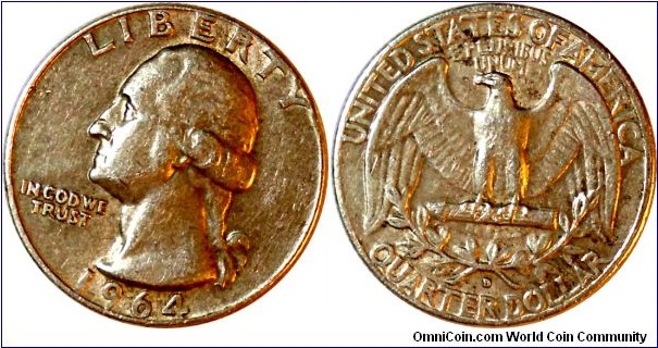
I'm a little thin on cash this week, so when I stuck my $5 in the machine in the break room, I asked Lucky Pierre to thrill me only a little since I needed the change for bus fare.
Lucky Pierre spat out a 1964D quarter in quite nice condition. Pictures when I get home.

Edit: As promised, here it is!
-
Another belated hippie bird day!
-
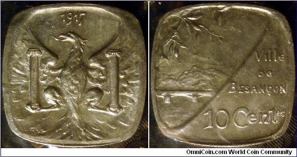
Ooo, I didn't know there was also a 5 centime piece! Gonna have to prowl eBay...
I wonder why Besançon's issues are so much more artistically engraved; most of the rest are fairly utilitarian in design.
-
I'm gonna vote no, but I've developed an appreciation for toners. If it really bugs you, I can provide my shipping address...
-
Ironically, they have to put you on a die to put you on a coin...
-
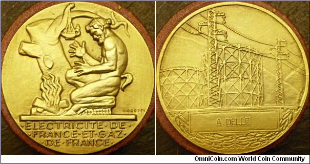
Yeah. The Greek mythology theme, the semi-Deco way it was executed... and it's just freakin' gorgeous.
Also, the price was right; most of the ones of these I've seen on the Bay of E have been twice what I paid for this, and this one still had its original case (the red-brown thing it's sitting on in the picture). It's estimated to date from some time between 1946 and 1955, but I haven't been able to research a date certain yet.The image doesn't really give a good idea of just how deeply sculpted the design is. I may take a few more from different angles. The satyr rises a full 1/8" from the field, and the finish is absolutely satiny. I don't know if it was gilded or if that's the natural finish (I believe they were struck in bronze, and I though bronze would be darker). It's 21/8" across; the details on the back are just amazing.
-
My first art medal:
-
These are lovely! I only have one of these myself, a Ville de Besançon 10 centime piece from 1917, but it's been a favorite ever since I got it -- it's just so beautifully sculpted. And I really should get better pictures of it.
-
Ooo, I hadn't thought about that. Yeah, I wouldn't object to the oak cluster and shield design for the reverse of the cent. I dunno about the quarter or the dollar. Gonna have to have a long cogitate on that.
I can't imagine separating the Indian head from the Buffalo reverse, the Mercury obverse from the fasces reverse, and suggesting the Walking Lib without its magnificent eagle is numismatic heresy in my mind.
-
If you disallow the current designs, I'll say the following (with my preference, if different, following in parens):
1c: Flying Eagle
5c: Buffalo (Shield)
10c: "Mercury"
25c: Seated Lib (Capped Bust)
50c: Walking Lib
$1: Morgan (Seated Lib)
And restore circulating commemorative halves.
-
Welcome aboard!
A friend of mine was trying to learn some coin magic; he bought himself some lightly circulated British decimal "crowns" for the purpose since they're comparable to American silver dollars in size. I suppose the key thing is that the coin be large enough to be seen, and shiny enough to assist in being seen...
There is something appealing about a really large coin -- they have so much room to play, design-wise.
-
...and okay, part of me wants to see the conspiracy theorists' heads explode if a coin bears the reverse of the Great Seal. I know, I'm a bad person sometimes.
-
There wouldn't be any agreement on historical political figures; the only ones who get a free pass are the Big Three -- Washington, Jefferson and Lincoln. You *might* get agreement on Teddy Roosevelt; I can't think of anyone later than that (outside of Ike, who's already had his turn) that has any hope of being non-controversial. You almost have to go to Revolutionary War figures like Sam Adams, Thomas Paine and Ben Franklin (wouldn't mind seeing him on a coin again--I've always loved Franklin halves).
Side note that I'm reminded of by mention of the American Revolution: the best typo I ever saw was in an e-book of Carl Sagan's -- I think it was The Demon-Haunted World -- that slipped one letter in Ethan Allen and turned it into Ethan Alien. Which brings to mind a completely different kind of green mountain boy. XD
I think the only way to get everyone to sign off on it is to put Liberty on it -- which I would love to see. Or something similar to the Flying Eagle cent design, which has always been a favorite of mine. Perhaps the Statue of Liberty; I think it deserves better than the reverse of a series that's no longer issued for circulation.
I'm going to reiterate a point that I've made before on this site, and I will always be willing to make again -- presidents don't belong on coins, at least not for a century past their term of office so that their contributions can be more fairly assessed. I would love to see the national symbols -- Liberty, the eagle, the flag, even the more obscure ones like the oak and the rose -- used on our coins. Political figures, with very few exceptions, are inherently divisive figures, especially those still within living memory.
-
Funny you should mention, I have an H. Dropsy piece coming that I bought on a whim, just because I liked the combination of classical Greek and Art Deco styles. Maybe I do collect them now.
-
Hippie bird day there!
-
Sweet find! I've always had a soft spot for Ikes.

-
Given that the last half of the series didn't even circulate, honestly, I doubt it.
Here's a thought -- other than the obvious solution of eliminating the dollar bill once and for all, what do you think they should try next to try to get public interest in a circulating dollar coin?
-
Can't say for certain without seeing the reverse, but it looks to me like a Thai 10 baht from between 1988-2009. Thailand mints a romping ton of different designs, and I don't read the script anyway, but the portrait looks right. Do you have an image of the other side?
-
I've long found Boggs to be fascinating; I have, while writing this, ordered Boggs: A Comedy of Values from Amazon; it should be a fun read.
He's been at this for quite some time, despite arrests for forgery in the UK and Australia and being investigated by the Secret Service in the US. He's very up-front about what he does; at no time does he present his creation as a real bill, he asks the recipient if they would accept it as one (given the value they have among collectors, there are few foolish enough too say no!), and documents the entire transaction.
They really do have to be looked at closely; besides the obvious 'at a glance' differences between his work and a 'real' bill, there are always little details in there that can only be seen on close inspection -- the one I saw had, in place of 'Federal Reserve Bank', 'Boggs Kunstbank' (art bank). I understand there's at least one Boggs £1 note where the Queen's eyes are crossed.
He's at least once done coins, making oversized plastic Sacagawea dollars (and financed the project with a $5000 bill he drew!).
Having a Boggs bill is well up there on my lottery list.
-
I think there will be both Ford and Reagan dollars; as I recall, the procedure was if they passed away two years before the series got to them then they would be included and that living former presidents would simply be skipped. I suppose the lead time is so the dies can be prepared; if something should happen to any of our living former presidents now, it's too late to include them.
-
I finally went to this exibition at the CMA, when Breakfast Club fell through at the last minute and I found myself conscious at what would otherwise be an untenable hour of the morning.
As a collector I was a bit disappointed at the failure to appreciate money as artistic objects in and of themselves. Mostly, it was an exhibition about re-thinking what we mean by 'value', about intrinsic and implied value, and the use of money out of context in an artistic way.
Alas, no photography allowed, so I can't show the few pieces I did like.
I will say that JSG Boggs' work is amazing; the piece they had on display was a $500 bill he drew to make a $430 purchase with Krause Publications, which they duly accepted and gave $70 change. Looking close reveals all sorts of little jokes and playfulness; at a rapid glance, though, one might easily mistake it for the real think. I can't imagine that m'self -- besides the fact that he only draws one side of the bill, I would stare at a $500 bill for a very long time before putting it away, just because one sees them so rarely. Especially on my budget.
Mark Wagner's Liberty also made a positive impression -- the repurposing of over $1000 in $1 bills to a huge collage of the Statue of Liberty -- and his process videos are fascinating.
One particularly ill-conceived piece was a "future quarter" stuck to the floor as if it had been dropped there, in a position making it impossible to get anything resembling a good look at it -- it was in a doorway, so getting down on the floor to take a look meant being in the way of other patrons. I couldn't tell you what I thought about it since I couldn't get a good look at it, but I can tell you what I think of the artist...
Most of the exhibition was about the use of money to make a social or political point, or to make art divorced from the design of the money itself, or both; Boggs seems to have been the only one to appreciate--or even approach--the art inherent in (paper) money as objects unto themselves, although he considers the entire transaction and not just the created bill itself to be the artistic piece.
I would say that if it comes to a museum near you, go see it, but don't expect it to be about the money. It's about the idea of money.
-
Ooo, I hadn't thought about introducing PIF over here - it's a great way to share the goodies, and for recipients to get introduced to new things.
-
Welcome! We have some similar interests -- I do British pre-decimal m'self -- as well as having started around the same age and being the same age.
-
Yeah, I ditto your
 -- I wonder how they're going to grade out.
 -- I wonder how they're going to grade out.
Latest Circulation Find
in My New Purchases
Posted
I am seriously starting to believe you're a time lord.