

syzygy
-
Posts
1,301 -
Joined
-
Last visited
Content Type
Profiles
Forums
Gallery
Events
Articles
Posts posted by syzygy
-
-
-
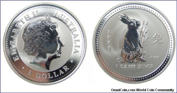
syzygy; 1999 One dollar; Australia; Group 8: NCLT
http://www.omnicoin.com/coins/906707.jpg
(bunny coin - tiff)
-
-
-

I don't think she is completely nude - there seems to be a thin, maybe see-through, Lindsay Lohan style garment there


-
Been slim pickings for me for a long time.
Did manage to see a drummer boy...

I don't really keep them as they are plentiful, but they catch my eye - a good design, I think.
Also turned up a wheatie - those are always nice to see.

-
I still lurk occasionally.

Everything got put off a month. Good thing I have worked for the government for 20 years and nothing they do surprises me any more.
I start July 6th and we should close on the house that week. I am looking forward to getting back into things. 4 months vacation is just too much. Cool. Stop in and let us know how you like it....and you *could* stop buying cameras for a few weeks and dust off the *other* collection
P.S. I was lol over that RIP message - I hope it will be back some day.
-
I'm preparing to take some of my Roman coins to the ANA to sell. ....
Let me know what you think and I'll post each of the images here as I build them. ....
First of all, in my opinion, they are very good photographs, so I really am responding to the "Let me know what you think."
Here's what I like.
The sequence shots that include the the coin edge. That's nice and adds to the presentation. Not just the edge, but a different angle to contrast the head-on shot and show the degree of relief. A second one for the reverse might also be nice.
The text - informative and in a nice font (not too artistic so as to be distracting).
The small, sized (ruled) photo - again, very informative.
I think you also have nailed the lighting pretty well.
I am not a fan of the reflection effect. It was novel, but I have seen it a lot and I guess that, for me, it does not add anything.
You have a lot of blank space - now I go back and forth on that. On the one hand, it's artistically pleasing - in the way that a museum-style picture frame is pleasing. The effect as a whole makes for a wonderful book cover, pamphlet cover, flier or something similar - quite professional. On the other hand, you have a lot of blank space where you could have coin.
Overall, a very nice style of presentation - terrific job.
-
I still have a Roosie and a Merc.
Hi stranger - I remember that roosie
You have new digs and a new gig? how you doing?
-

That is a really tasty trime and a good example of where an AU58 can be more desirable than lower MS grades
-

Possibly artificial
-
Slightly misaligned obverse die (just enough to notice and these are rarely dramatic). See how the reverse is centered unlike with a collar error where both sides will be displaced.

-
Collar error

-
Another frosty nugget

-
Another nice aspect of the series is that I think that they look quite nice when circulated...this one is maybe a VF..

-
That is a great looking 64 dime it looks like it is unc.
That one is a proof.
I would call this one UNC although not a very good strike - I use it in my US dime type set.

-
It's is an under-appreciated series.

-
Good old-fashioned, original surfaces, as God intended, toning counts too!

-
Circulated and common but a favorite of mine that I picked up for $1 or $2 several years ago. Its color has changed a bit over the years but it was, I believe, classic sulphur-carbon monoxide induced toning.

-

(blatantly artificial)
-
I literally found this one last week, while walking in a parking lot. It was reverse side up and I spotted it right away. I can see some new scuffs so I don't think it was on the ground for too long, but I would love to know how it got there.

-
Also picked up this high grade Liberty nickel. This is the first year of issue and before 'Cents" was added to the design. These are the ones, so the stories go, that were gold plated in the hope of passing them off as 5 dollar gold pieces - the "Racketeer" Nickel . Later in 1883 the design was changed and "cents" appears from then on. Even in high grades, these are relatively low-priced.

I really like closely inspecting new acquisitions. Check out these hairline die cracks - not at all unusual for early nickels. I imagine these would disappear with wear rather quickly.


-
My first purchase in a *very* long time. Went to a local shop to peruse the wares and this silver 5 cent struck my fancy. I think it's a nice one.

-
Not much of a find, but I really like the way some of these copper Lincolns hold there luster...not sure where this one as been for the last 46 years, but probably not circulating much.


PCI2010 Group 8 - NCLT : Submissions
in PCI2010 Archive
Posted
syzygy; 1991 One dollar; Mexico; Group 8: NCLT
http://www.omnicoin.com/coins/908699.jpg
Mexico, 1991, 1 Onza (ounce) KM # 494.2, Silver, .999, 1.0 oz Mintage: 1.65M