

Ætheling
-
Posts
4,087 -
Joined
-
Last visited
Content Type
Profiles
Forums
Gallery
Events
Articles
Posts posted by Ætheling
-
-
Well it's time to go against the Yemen for a change and stick with the facial hair.
-
YeOldeCollector
That is one awesome coin and anybody would be proud to own it. I have gone that far back looking so maybe I should start as I'm only looking from about 1790 to 1970.

In my opinion the earlier stuff is better. True that from 1790 onwards British coins started to look more modern and have more varied and artistic designs (as opposed to the simplicity of the cruciform shield designs that ran from 1662-1787), but the obverse designs are of a much higher quality on the earlier coins. The reverses may be very low relief and simple but that was so the obverse could be the focal point, very detailed, decent amount of relief, quaint but addictive.
-
-
As weird as it sounds, it is quite possible that as silver coins continue to be melted down, that eventually some "common dates" might actually become scarcer than some of the "semi-keys"
I think that's very much possible!
-
Many British guineas have been either holed or mounted for use as fobs with pocket watch chains.
The other biggie is the sovereign, not so much holed but often adapted for all kinds of jewellery, not so much watch chains these days, but rings and pendants are fairly plentiful in jewellers' shops.
-
I assume that the direction of the portrait would be entirely up to the designer. It is thought that such designs were presented to the monarch before coins were produced and so, if he was happy with it, it would be minted. Obviously this cannot be true for every monarch, I do think that the designers would have a lot of freedom to do what they wanted to his portrait. Therefore I think it is purely up to the 'artist' as to which way the monarch is facing. Of course, they would have to follow tradition though.
This must certainly be the case for John and Richard I pennies, all of which were struck in the name of Henry II, bearing in mind that Henry II's children were at war with him at the time of his death, I can't think Richard would have purposely chosen to have his father's name on the coins. I suspect it was the case that the coins worked, Richard didn't really care (as his interests lay elsewhere, towards capturing Jerusalem) and thus the status quo was kept. Seems odd when you think about it though because in a time before mass media and newspapers, coinage was really the only medium for the monarch to assert his authority in a non physically having to go and visit way. The Romans used them, the Anglo-Saxons used them and so did the Normans, how comes the imagery of royal portrature took a backseat in Richard and John's reigns?
-
The French coin's a beaut too! Very striking design and gorgeous detail, might have to look around for one of those.
-
An excellent Henry I coin! A particular favourite period of English History for me.
-
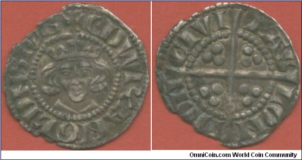
Sylvester; Henry II (1154-1189) English Penny; Group 2 - Medievel 500AD-1500
http://www.omnicoin.com/coins/899302.jpg
Sylvester; Edward I (1272-1307) English Penny; Group 2 - Medievel 500AD-1500
http://www.omnicoin.com/coins/902499.jpg
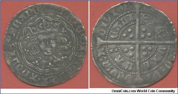
Sylvester; Henry VI 1422 English Groat; Group 2 - Medievel 500AD-1500
-
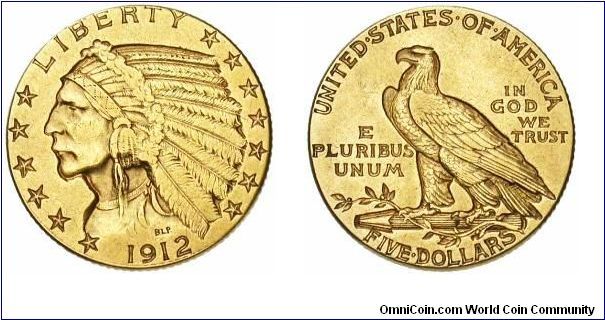
Sylvester; 1912 USA $5; Group 6 - 1901-2000
-
Sylvester; 1786-B Austrian 2 Ducat; Group 4 - 1701-1800
http://www.omnicoin.com/coins/901536.jpg
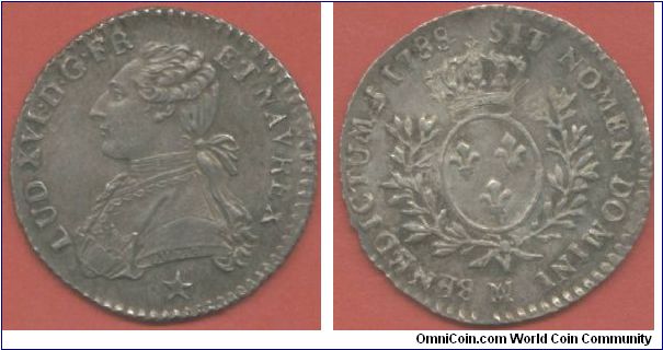
Sylvester; 1788-MA French 1/10 Ecu; Group 4 - 1701-1800
http://www.omnicoin.com/coins/901535.jpg
Sylvester; 1714 British Half Guinea; Group 4 - 1701-1800
-
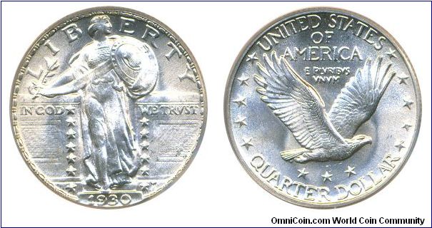
Sylvester; 1930-P USA Standing Liberty Quarter; Group 6 - 1901-2000
-
Actually thedeadpoint you'll probably like this more, here was another obverse design (with it's picture deleted;

And the other reverse

-
Wow. Great job! That looks like it took a lot of work and planning.
A few comments:
- I see you have represented the female reproductive system on the obverse.
- I'd personally like to see more contrast between the design features and the fields, especially on the reverse. Preferably lighten the inner field on the reverse.
- Add a 3rd color or lighter shade. It's a very dark design. Perhaps make the "ohm" symbol dark and the background light.
It's funny cos it didn't actually start out that dark! lol. Originally where the two phoenixes are on the reverse were some pictures (very bright, very vibrant), hence the darker areas were added to bring in a contrast and it worked very well too I might add. Sadly I was aware that I didn't hold the copyright to the pictures so I didn't use them and dropped them, pity cos a lot was lost with their removal, and hence why the background is now on the dark side shall we say.
I'm gonna play round with the colours anyhow so i'll try some of your suggestions and see how they go.
-
nice!
Will there be a hologram with his arms waving?
Now that would be cool! Sorry I haven't fathomed holograms yet.
Actually I'm working on an alternative to the above, a pictoral series... but i'm still drawing the pictures at the moment, so dunno how they'll come out! I'll post one up when i'm done.
-
Well it's been a while since I designed any new notes for Coinpeople, but here is a potential design that's in the pipeline.
The first series of 'Imperial Bank of Coinpeople' Notes were distinctly British in flavour, the second series paid homage to Rome, the third series (a favourite of mine) was the recent American series of denarii notes (many of which were kindly posted out by Art at Christmas), with themes of liberty, eagle, buffalos etc.
For this new series however, i've decided it was time to branch out from Brit and American things and go East, it was either going to be a Chinese or Indian theme, well this time the Indian theme won out but future series might include Chinese or even Egyptian style notes (i'm really liking the though of Egyptian). But for now here's a sneak preview of a potential design that I was working on back in August. The reverse I am fairly satisfied with, the obverse needs some work I think, comments/suggestions welcome;
Obverse

Reverse

-
There's a Coinpeople facebook? Wow! That i'd didn't know.
-
It's not fair to make only one group group for 1901-2000!
It's a valid point banivechi, although following your argument maybe 1901-1950, 1951-2010 would be better? However, on the other hand having co-ordinated this competition in the past I can totally understand Art's choices. I always used to strive to make it as simple for myself as possible. The problem when you start breaking categories down into ever smaller chunks is two fold;
Firstly the competition becomes more of nightmare to run with more categories etc. and secondly (and perhaps more importantly in my opinion) there becomes a greater bias towards coins issued in the twentieth century.
Now when I ran it I confess I did sometimes split the twentieth century down the middle, but as consequence there was always twice as much twentieth century stuff than there was any other for any other century. Simply put this isn't really fair, from a personal point of view I always considered the 19th century to be the richest century in numismatics (even though I own nothing from that century).
Then of course another reason behind the whole competition is to try and highlight some of the less well known areas of the numismatic world. There are many rich and wonderful pieces from earlier centuries, and several collectors on this forum are well equipped with earlier offerings such as the 18th, 17th and 16th centuries, surely these deserve as much air space as the 20th century?
Just a thought.
-
Only positive comments from me. Feel free to violate the 'rule of 8'
, afterall you're the guy running it so it's up to you how you approach it, everyone has their different ways of working. Sounds great and count me in.Let me know when you want the entries so I don't miss it!
-
Happy Birthday! Hope you're having a good one.
-
Looks like we are! Sorry i've nothing from 1607 either.
Anyone?
-
Had to bring this thread back, a new acquisition heading my way (my first this year now i'm a semi-retired collector).
Anyhow, I've always wanted one of these and I've finally found one in a grade that's high enough to see any detail but low enough to be anywhere near affordable! And without all the usual abuse; holes, plugging, mounting etc.
I kinda regret selling off all my few Early Milled gold coins back in 2004, missing them so I finally decided to push the boat out and buy another. I love half guineas.
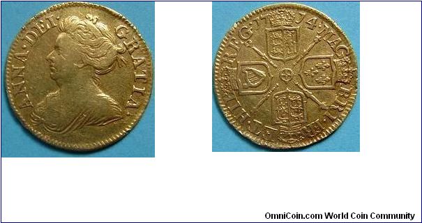
Not the best picture but hey.
-
I used to have these coins, all sixpences;
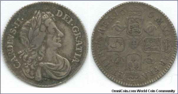
1676/5
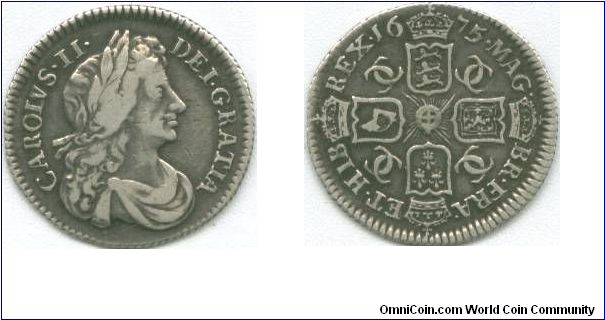
1675
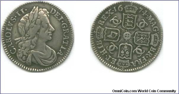
1674
-
I thought for a minute that i might have had a 1784, but alas it's 1783.

PCI2010 Group 9 - Exonumia FINAL Vote
in PCI2010 Archive
Posted
Silver